BLOOM
Art direction | Brand identity | Photography | Print | Website | Marketing Materials | Events Materials


Project Details.
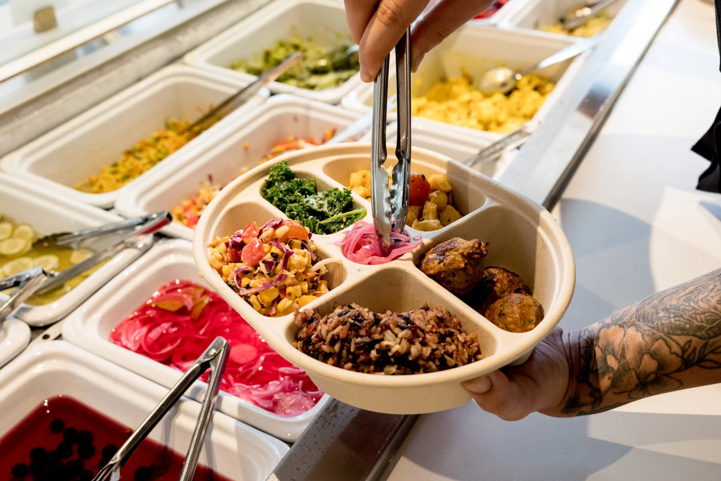
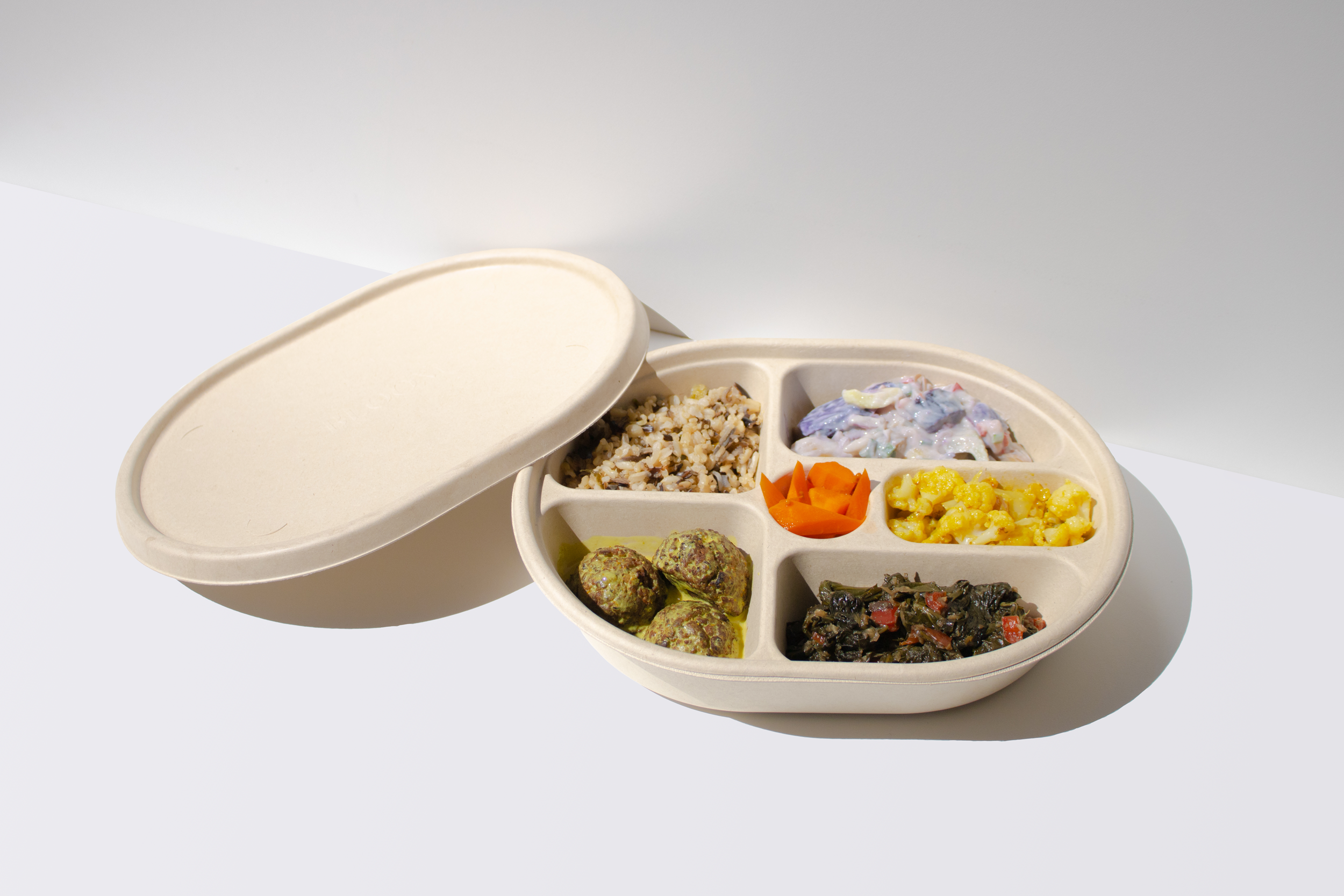
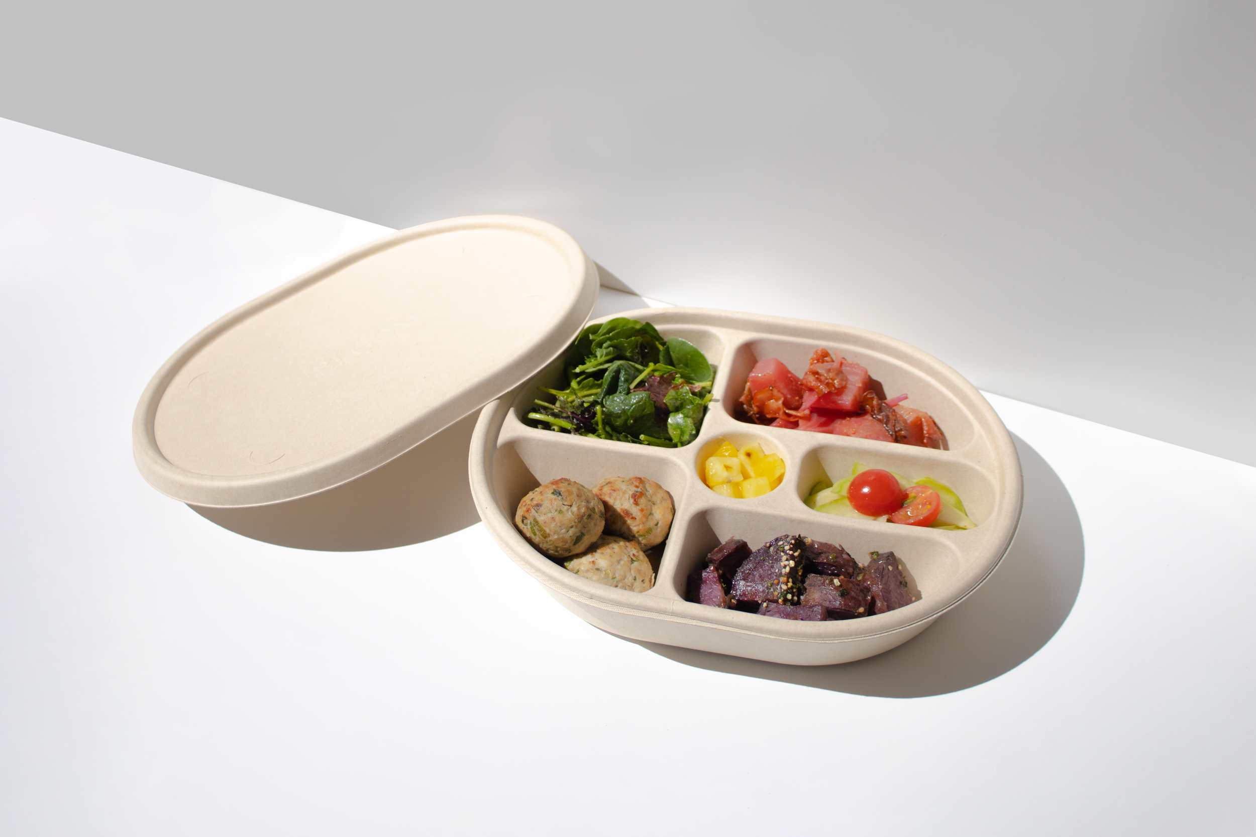
Bloom is a quick-service restaurant in Seattle, WA offering gourmet and nutrition-focused meals.
The concept for Bloom centers on a fast–fine dining experience, where the customer can expect the craft and flavour that goes into a fine dining menu but done in a way that is geared towards efficiency and accessibility.
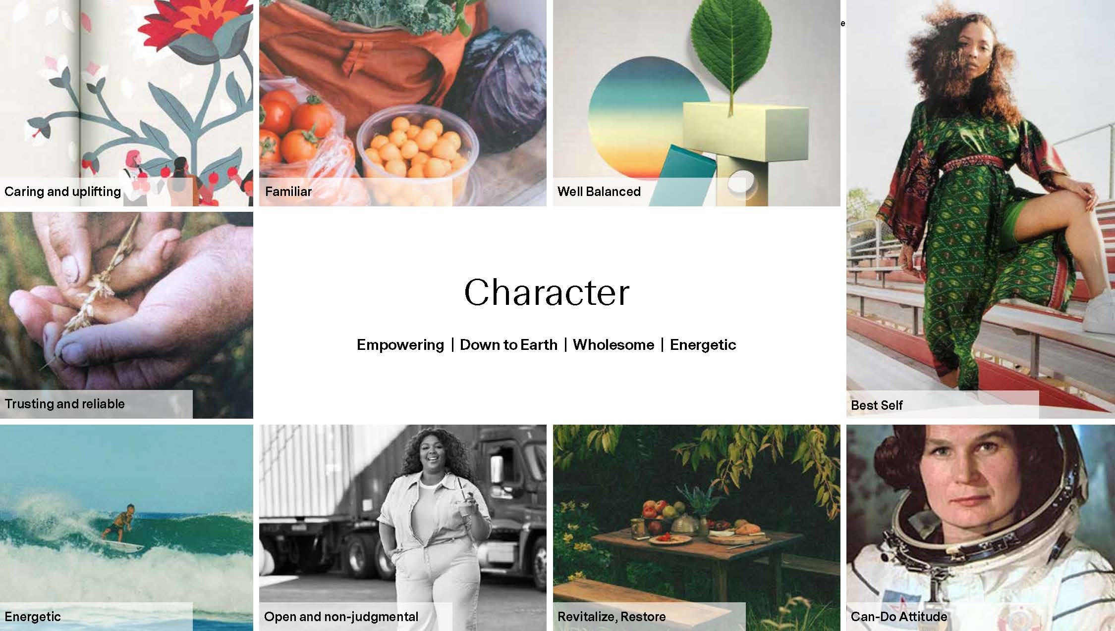
Given the business’s goal of mixing high touch and low barrier, the main design challenge for Bloom was to create a brand and character that felt both elevated and approachable. To me, this meant something bold, bright, lively, and full of a character; something that carefully balanced positive and negative space as well as an exciting contrast of flat and organic shapes in order to combine sophistication and a commanding attitude with energy and vibrancy.
The Bloom logotype is all uppercase the breaks in the font represent a natural dynamic tension that exists between aspiration and reality, an analogy for one’s mission to achieve health and wellness as a daily ritual. As part of the identity we also wanted a logomark that was recognizable, elegant and that elevated our brand as a whole. I explored a number of elements from nature, and ultimately found the Gingko leaf – a symbol of longevity, vitality, and wisdom and the perfect fit for the values of the business.
Photography was also an integral part of the brand from the start, and I was able to utilize my experience in photography to produce the initial photographs which help set the tone for this important aspect of the identity.
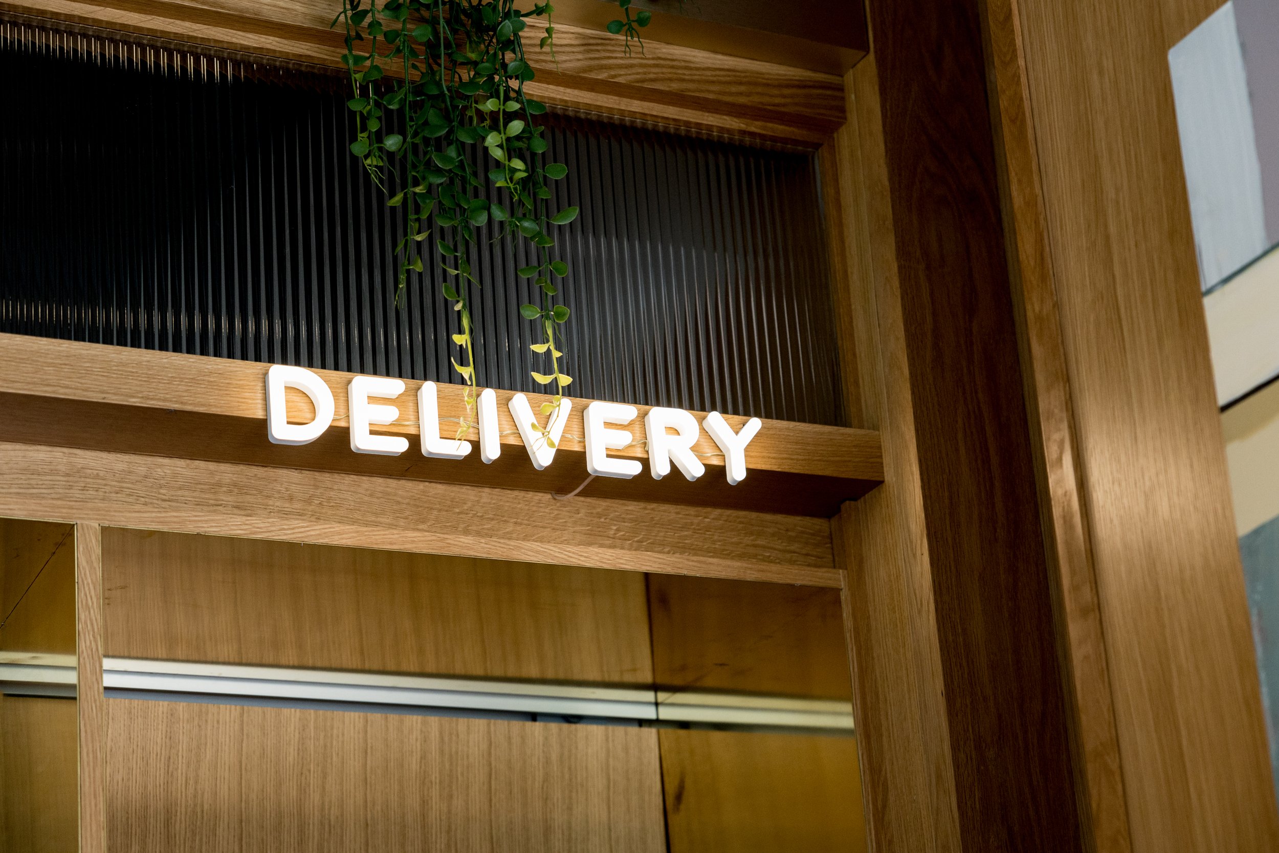
The identity was then extended through a family of brand elements including brand guidelines, art direction, website, social media and environmental applications.
Credit: In-House Design, Marketing, Strategy, Development Team.
Website: bloomfoods.com