Quail Landing
Art direction | Brand identity | Print | Website | Marketing Materials

Project Details.
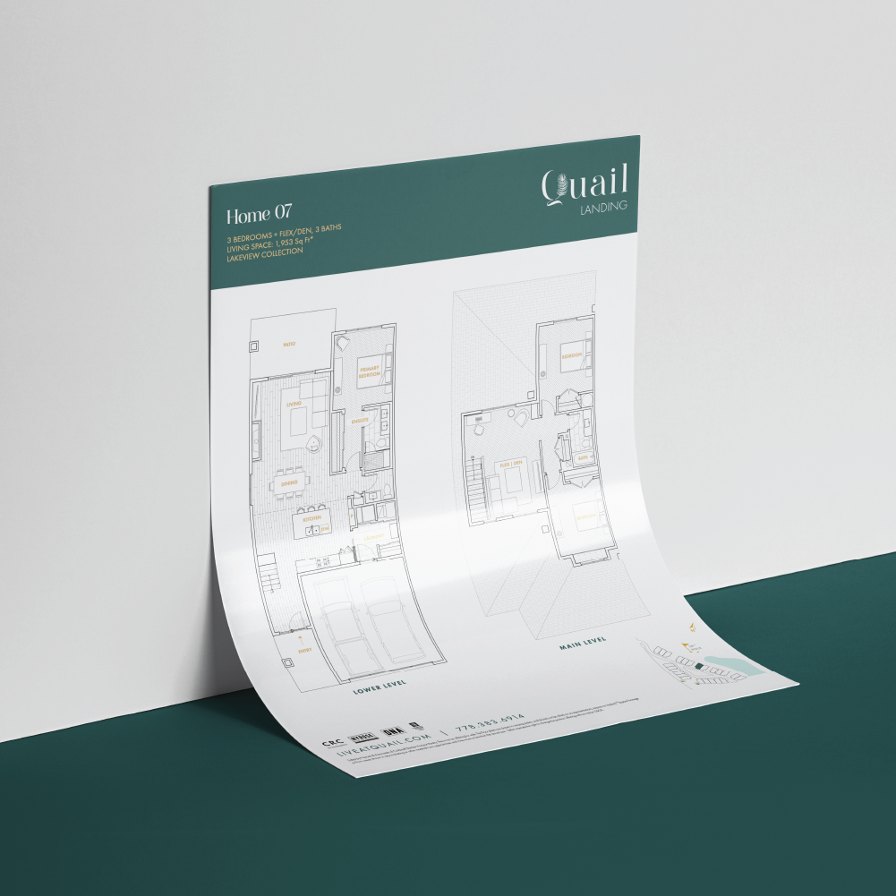
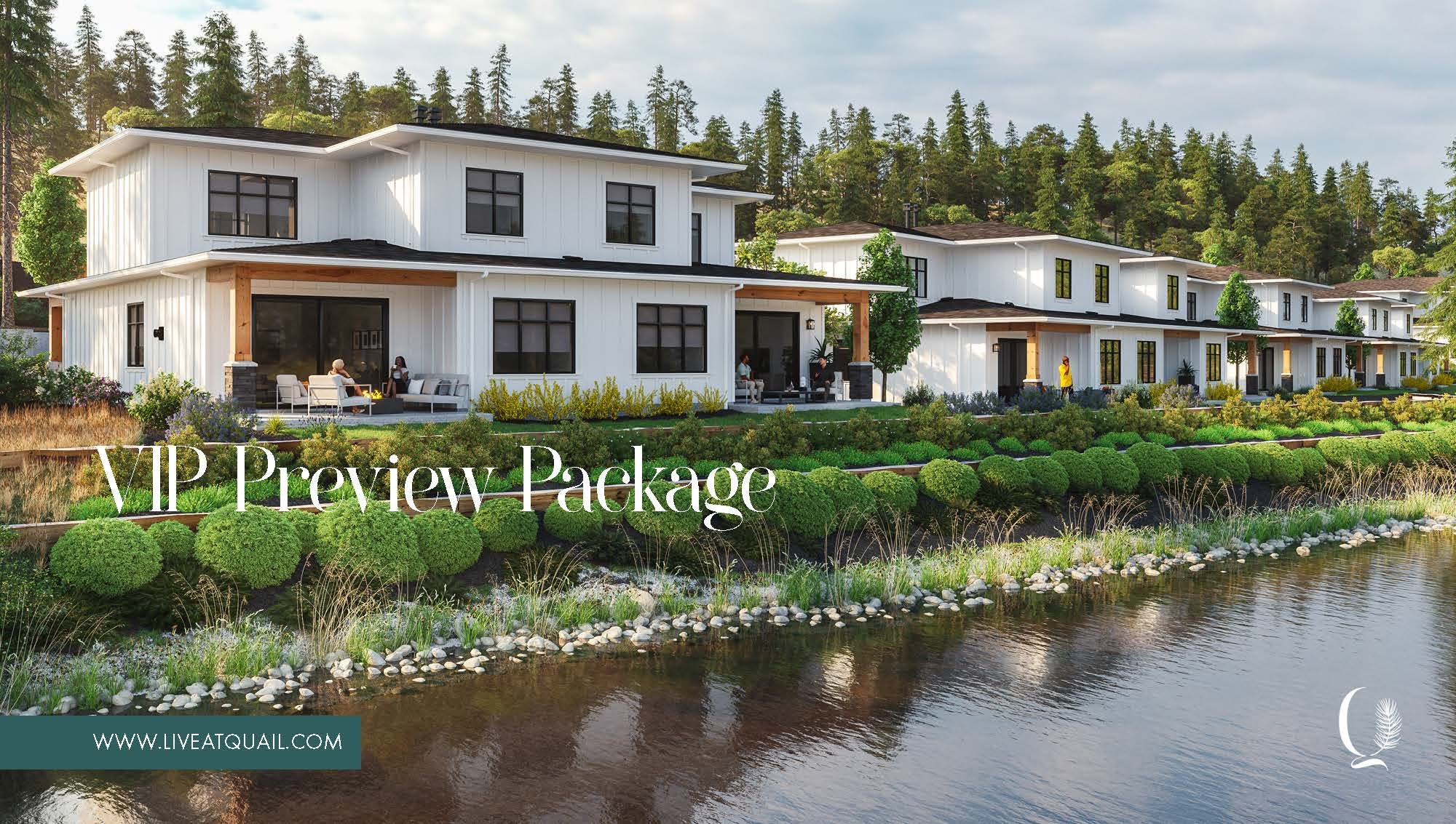
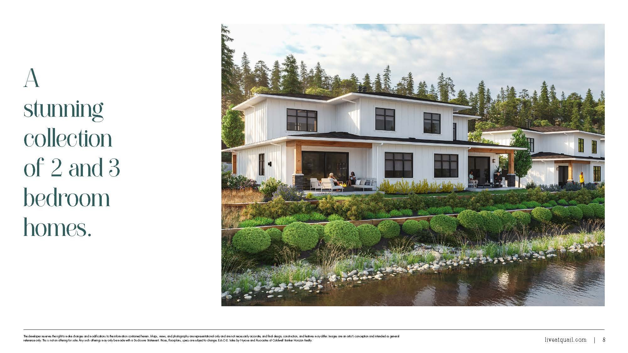
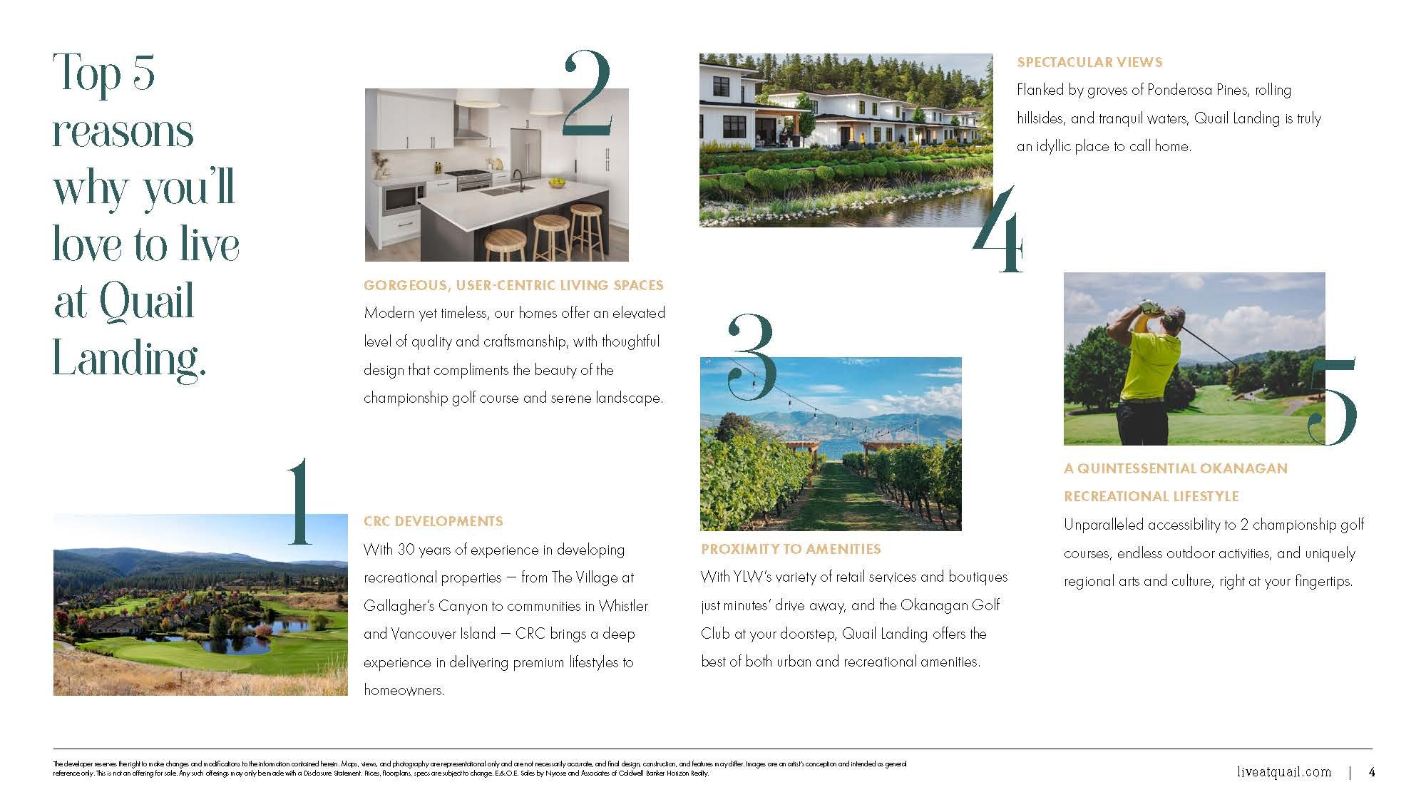
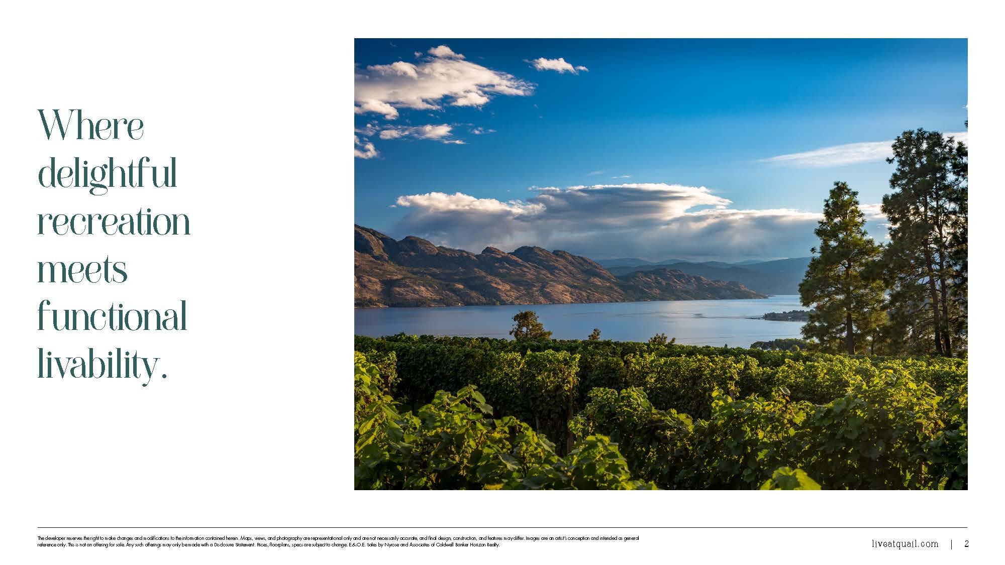
Nestled along the 18th hole of the Quail Course at the Okanagan Golf Club, Quail Landing started in February and is still ongoing. Is a stunning collection of 2 and 3-bedroom townhomes located in the heart of a breathtaking landscape.
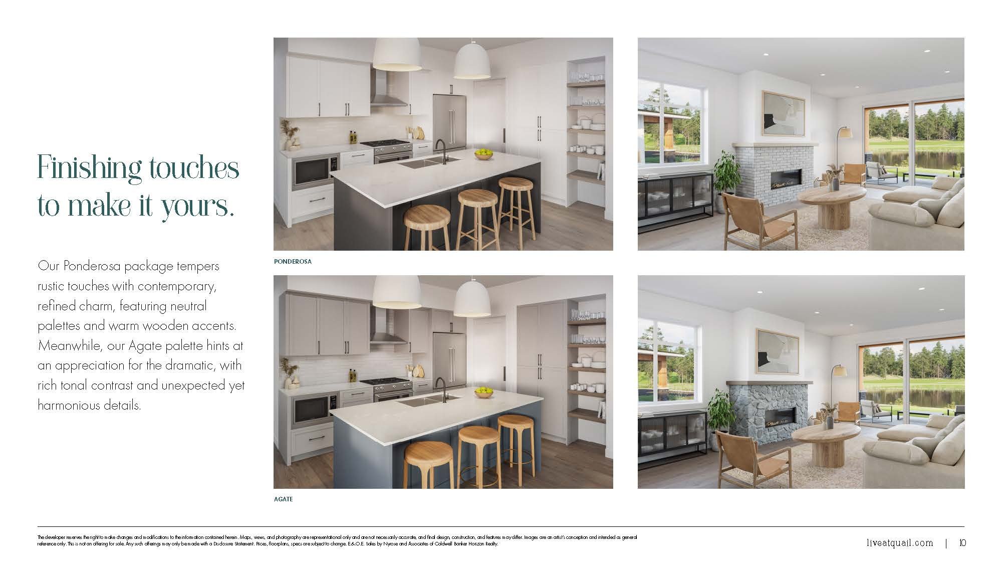
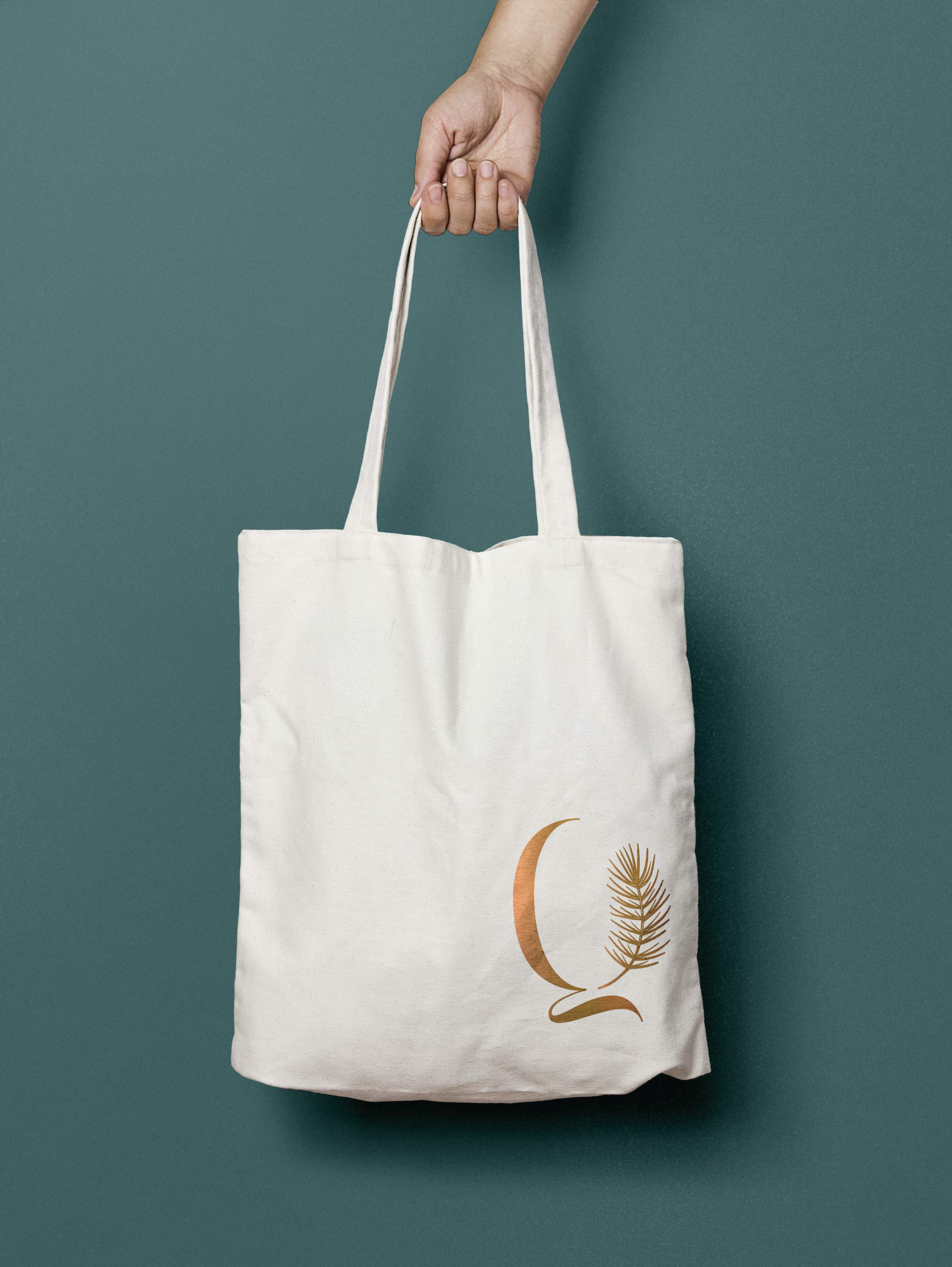
The logo and the entire branding had to be modern, sophisticated, and suitable for a project with high-design finishing, sophisticated function, and panoramic views.
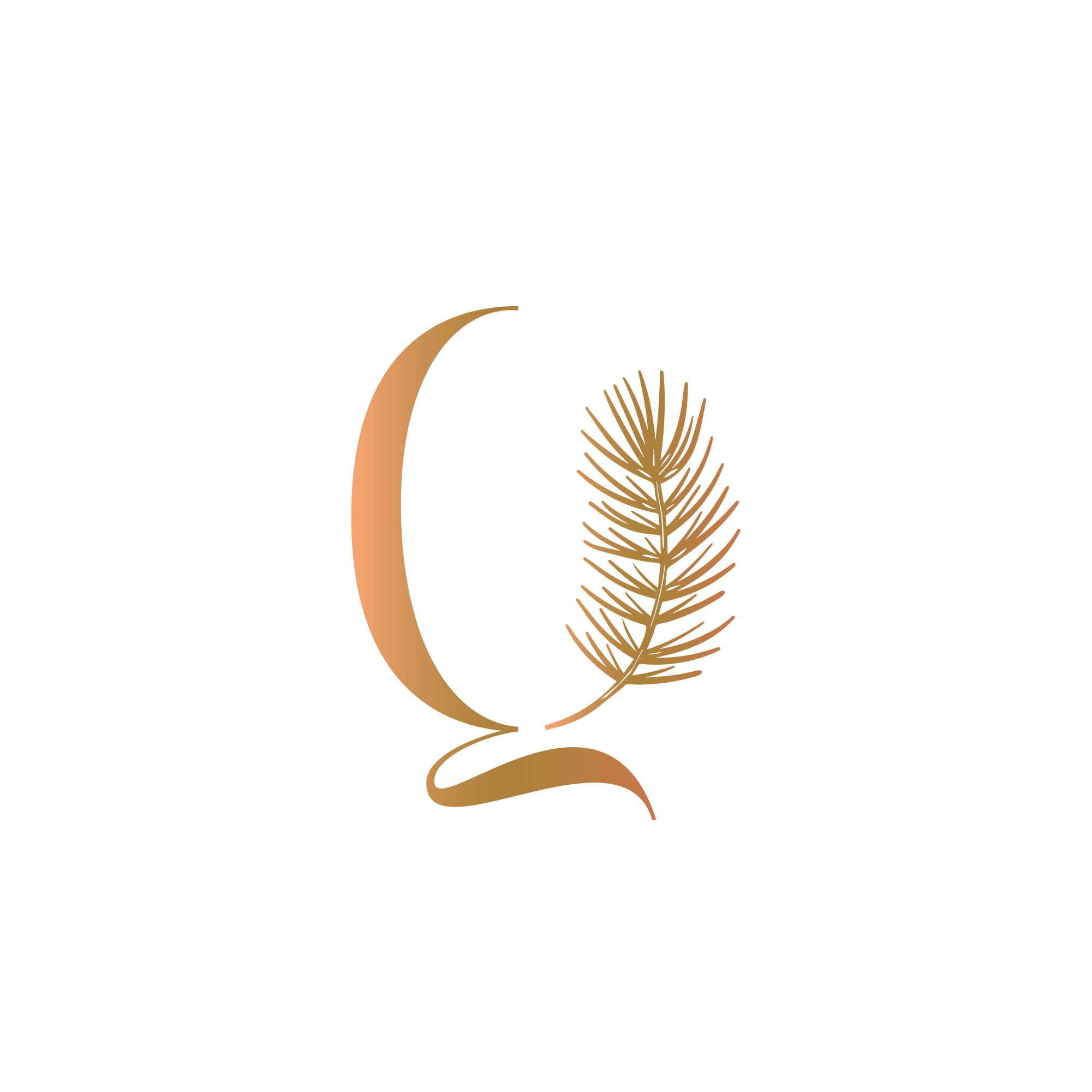
I've played a lot with the marriage between positive and negative space and the idea since the beginning was to integrate a "leaf" of some sort of an organic element into the logo. I've started to study the botanical aspect of Okanagan, research all the plants, and get inspired by them. After many revisions, many drawings, and a lot of feedback, we came to a conclusion for our logo and our beautiful monogram. We designed a very elegant and clean logo, that marriage perfectly with the vision that we had at the beginning.
We proceeded with the development of the branding, all the collaterals like floorplans, signage for the entire building, amenity map, postcards, flyers, website, and the brand's guidelines.
Looking at the complete work we realized that the approach we followed was the right one. The branding that we created was perfect for the project.
Credits: Burrard In-House Design, Marketing, Strategy, Development Team.