Tealeaves X Pantone
Branding Identity | Packaging | Photography | Set design | Print

Project Details.
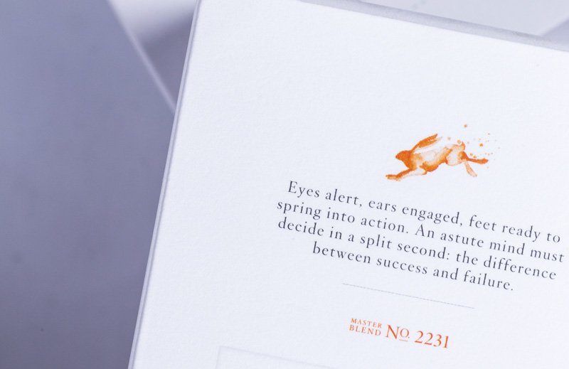
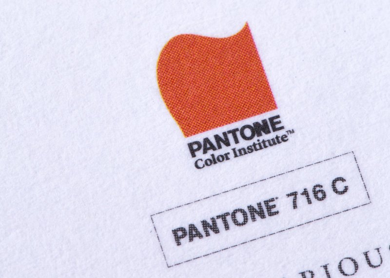
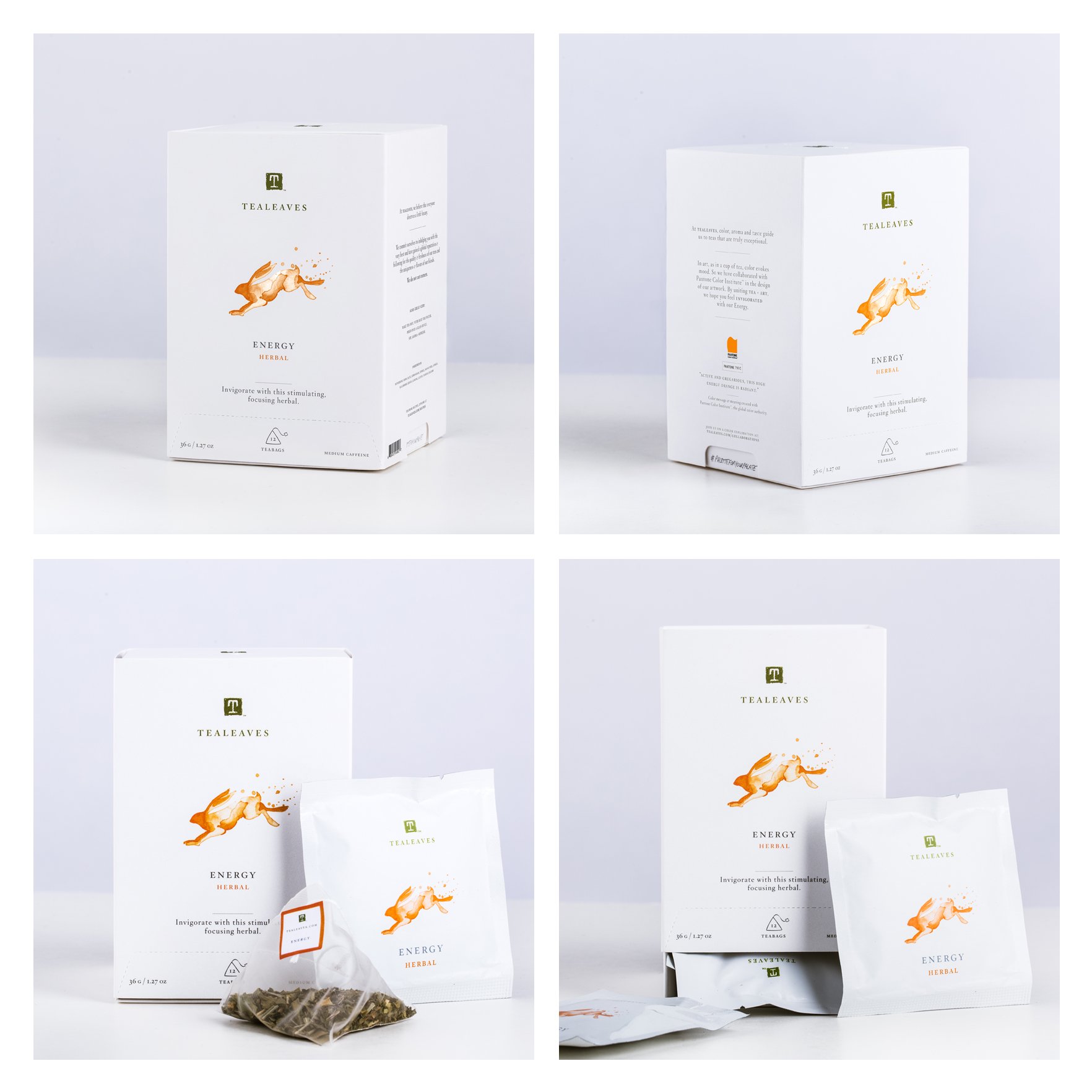
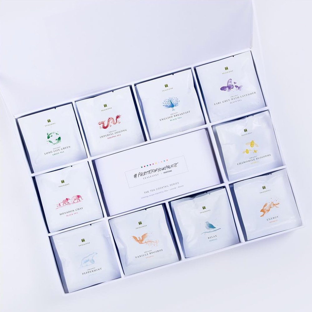
In luxury, it’s the details that matter. TEALEAVES blends its teas specifically for color, alongside aroma and taste, with the understanding that “the first taste is with the eyes”. This philosophy inspired the #PaletteForYourPalate project in collaboration with Pantone and 30+ world-class chefs and mixologists—from the iconic Beverly Hills Hotel to The St. Regis San Francisco.
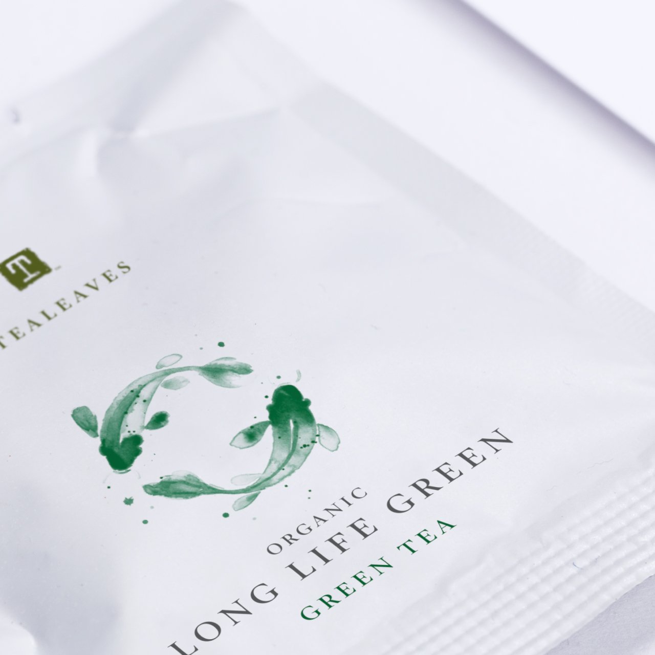
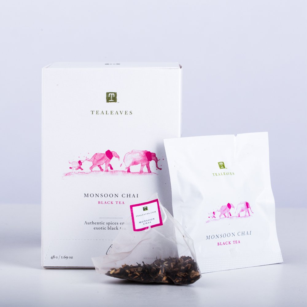
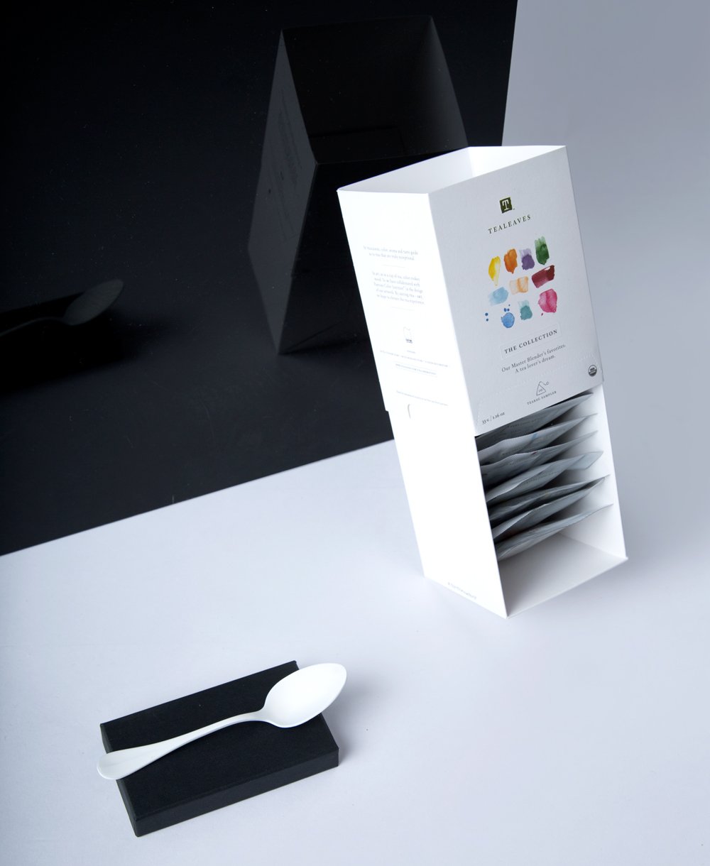
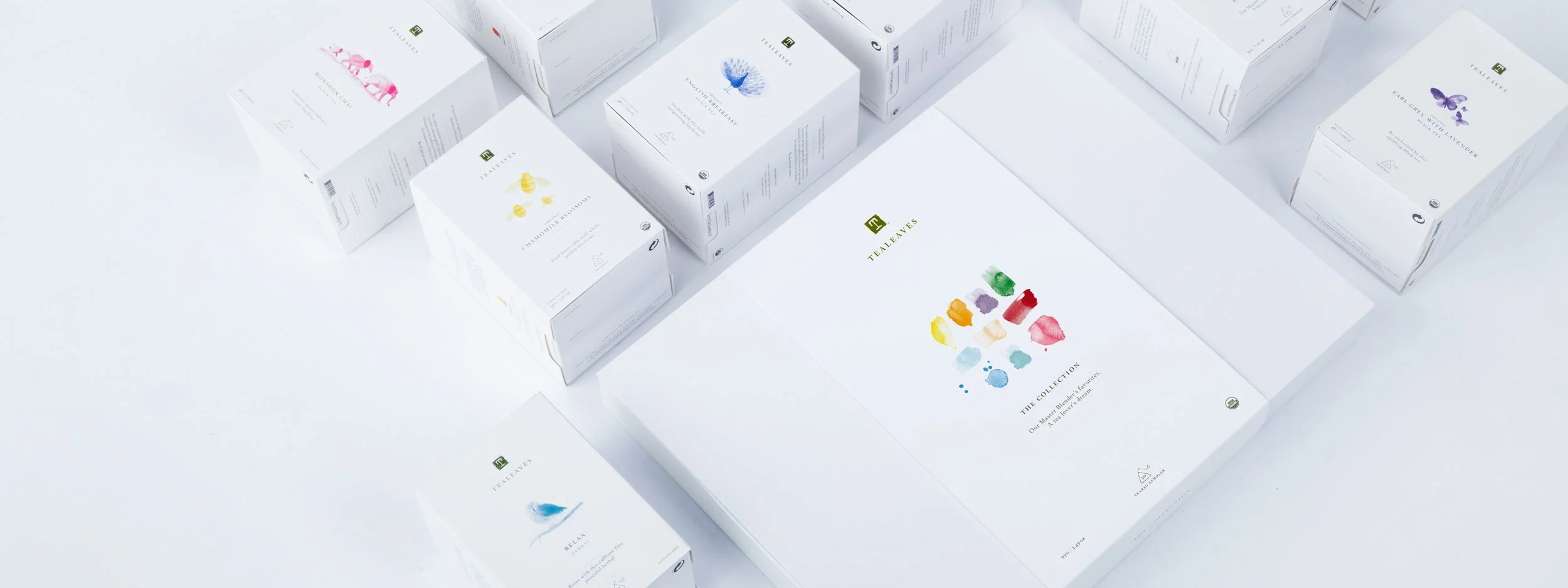
A minimalist direction was chosen to effectively evoke this selected mood and color, while conveying the purity and quality of the product inside. The link with the company’s heritage was expressed through having the same in-house artist, who had illustrated all TEALEAVES packaging, create the illustrations. Emotional, yet whimsical, each teabag overwrap and the retail box would have a monochromatic watercolor animal to symbolize the mood, accompanied by a poetic blend story, to enchant the consumer. The watercolor art direction was minimalist and slightly abstracted, with movement-inspired strokes and nuanced layering to communicate mood and color. Instead of an animal, the imagery on the sampler package of all flavors would contain abstract watercolor strokes in each selected color, to create the full “Palette For Your Palate”.
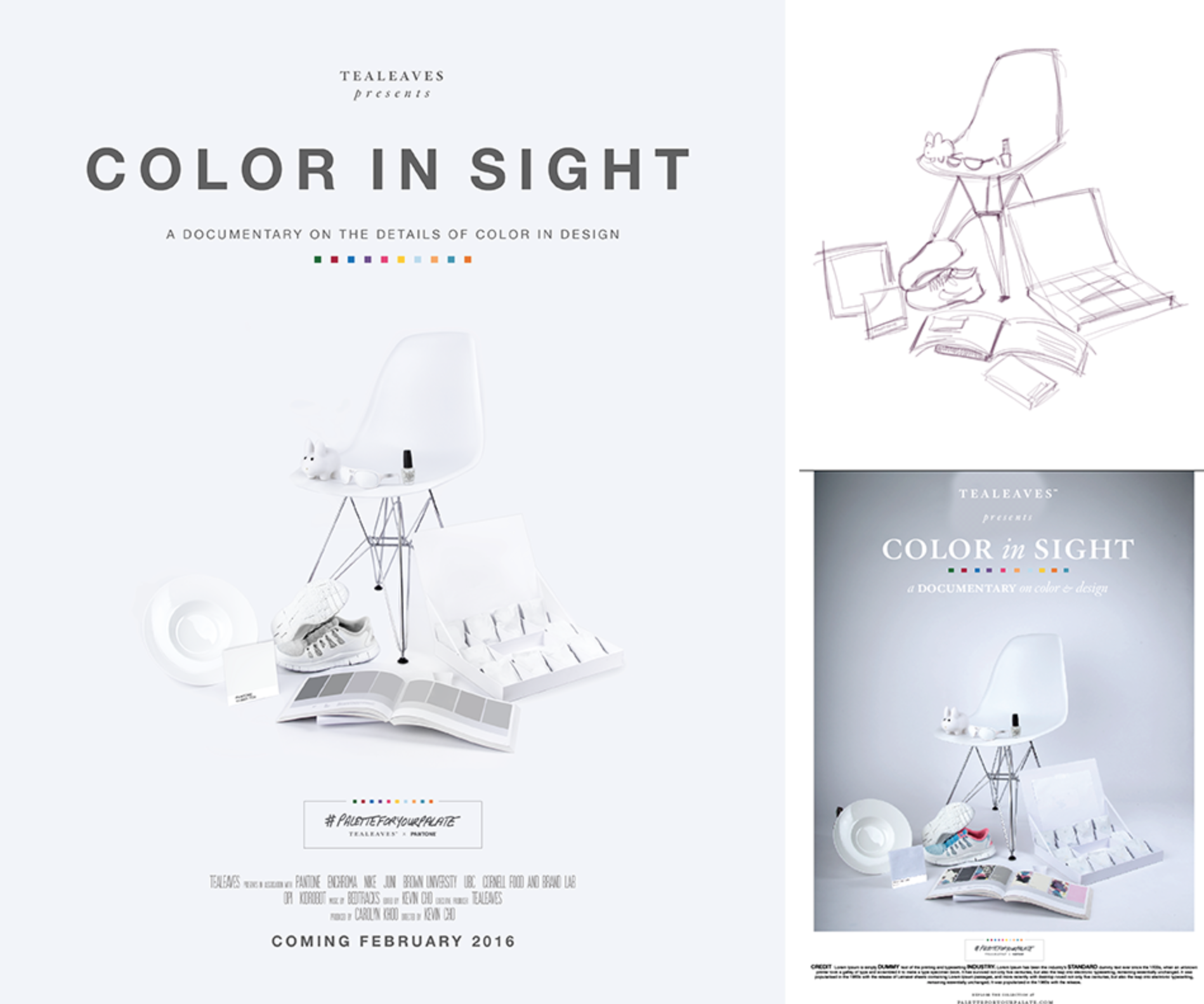
Explore the exhibit of tea + color + mood at paletteforyourpalate.com — which was nominated for a 2016 Webby Award and was featured in FRAME Magazine, Elle Decor, and the Dieline!
Credit: Tealeaves In-House Creative Team
Website: www.paletteforyourpalate.com